Week 5 – Oh god, it’s moving !

Welcome everyone for this last but not the least post !

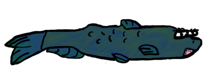
Today I’m going to talk a bit about the animation I made for our main character. Since I wasn’t the one who made the main character, I decided to keep the same first frame that my teammate Felipe had already done.

I used a frame without the hands because one of the hand is going to be on top of the gun so ot wasn’t important to animate it.

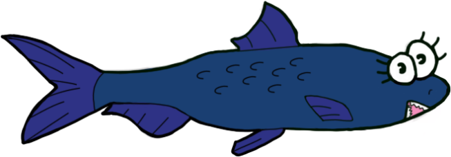
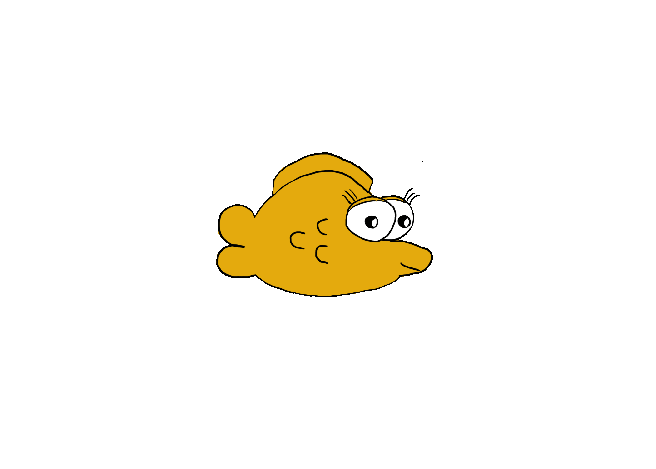
Here is the frame I therefore used :Main_Character(NoBFins)

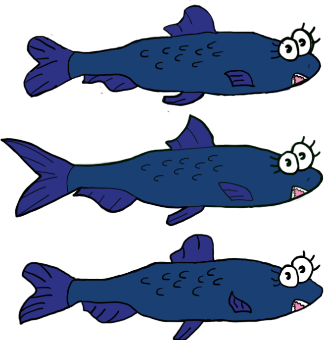
I had then 2 choices, either I could have used the frame by frame animation as I did for the previous animation I made for an enemy, or I could have used the animation tool from Unity called Anima2D. I finally  made my choice and kept the same method I used for the enemy which is animation frame by frame because it was more coherent to have the same kind of animation for both of the characters. Then the question of the numbers of frame I had to do came. I did 3 frames for the enemy so I started by just doing only 2 frames for this ones and see if that was enough and if the result looked good enough.

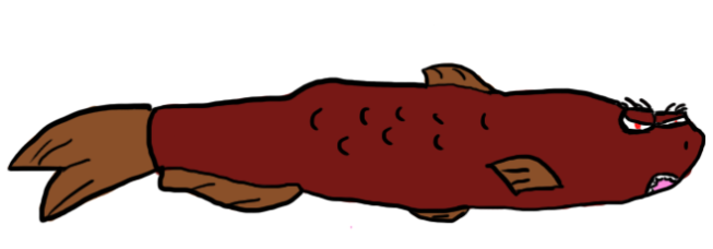
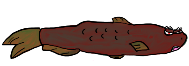
Here is how I proceed, I loaded the placeholder into Photoshop and then on different layers I redraw the same body excepted the fins and the nose.

For the back fin I made it smaller in one frame and bigger in the other one to have the impression of it moving.

For the tail fin I made it up in one frame and down in the other one to have a bouncing while added together.

And finally I made the nose at three different size to have the feeling of the character advancing when the player press left or right, and add a little of cartoon feeling to the main character.

I kept the colors as they were for the placeholder, which is simply yellow and white for the eyes.

Here is the final frames : main character

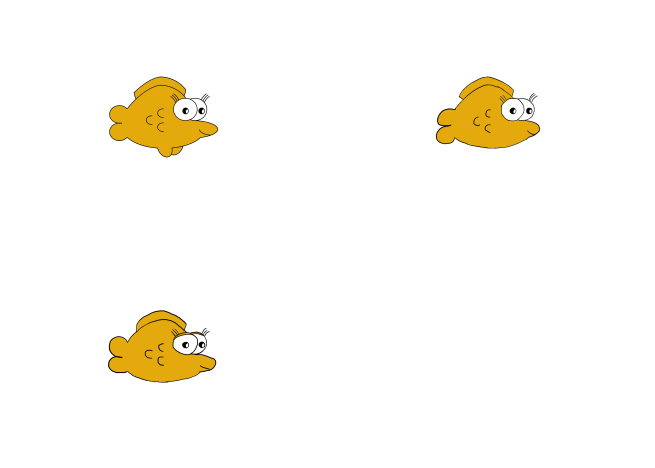
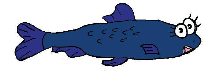
And here is an overview of the final result with a gif made with ezimba :

mcanimategif

I am pretty happy with the result even if I think it looks better in the game because I couldn’t do the same speed with ezimba.

Anyway that’s all for today folks, I hope you liked it and see maybe later !

/Axel
Team Quetzalcoatl


Week 4 – To crush your enemies, to see them driven before you.

Ladies and gentlemen, welcome for the blog of this week ! As you noticed already in the title, I will talk today about all the work I’ve been through this week to draw some sprites for dead enemies. (I’m sorry for all Conan’s fan who thought that according to the title I was going to talk about Conan, but the cake is ALWAYS a lie. 😛 )

So, this week I was in charge of drawing some sprites for the 2 types of enemies we already include in the game for now, which are the blue sardine and the angry red sardine.

I first started drawing the blue dead enemy in Photoshop and I tried to make the enemy a bit bumpy to bring out the fact that it is dead. I also thought that making it more flattened could also bring out a feeling of crushing and thus of it being dead.  For the eyes, I tried to make them smaller with the enemy looking more dull since it is supposed to be dead. I have chosen to make the fins smaller and gave the impression that they are falling as if the enemy could not bear the weight of it any longer.

As for the colors, I used the same 2 different blue I used for the enemy frame and added 2 more colors on top of it with the help of the Mixer Brush Tool. Thanks to that tool, I was able to mix the blue with two different shade of green : a pale green for all the fins and a green more yellow/brown for the rest of the body. The reason why I did that is to make the body look kinda rotten and past and here again, improve the feeling for the player that the enemy is know dead.

Here is what the final blue dead enemy look like :

deadenemy

For the red dead enemy, I did pretty much the same thing as I did for the blue one. But for that one I did two samples, one without the Mixed colors on the dead body :deadenemyred

and another one with the green color mixed to it once again with the Mixer Brush Tool : deadenemyred2

Now you can compare them both and in my opinion the second pattern looks better because of the green added that gives an impression of decomposition to the dead body. But I guess it is up to one subjective point of view to decide on which one is better ! 😛

And that’s all for today, thank you for reading, Axel out !

/Axel
Team Quetzalcoatl

Week 3 -Designing a death screen

Hello world ! In this new post I am going to talk about the death screen I made for our Game selfish.

So, I was asked to draw a death screen to implement in our game. The screen is going to appear every time the main character dies and will be a transition between the actual time the player looses and starts again. Thus when I started making the screen, I wanted to put a game over and a continue with two choices (yes or no).

In order to find inspiration I looked online at different death screen from lots of famous game such as Metal Gear or Donkey Kong Country, and I actually find the second one pretty interesting so I used the same kind of disposition for the “GAME OVER” letters. (and I remembered it also from playing the game when I was a kid, so nostalgia probably helped in that decision :p)

I didn’t drew the letters myself because it looked terrible when I first tried to, so I used as a font called Snap ITC one that I really appreciate and that looks a bit cartoon in some way, which was exactly the type of typography I was looking for. To color the letters I chose two colors : Dark red and pale blue. I’ve chosen those two colors to contrast the blue of the bubble of water within the tank and the red of the blood from the dead fish.

I added some bubbles sampled from the one an artist teammate had already made and I drew some blood stains by making them look like bubble of blood. Here again I did it with the intention of contrast with the bubbles which grow up with the “GAME” as an invitation to start again, and the blood stains that flow down with the “OVER” as an invitation to end the game.

Here is the picture I sampled the bubbles from :

Player Bubbles.png

Finally, for the background I used a dark grey to start filling all the background and then I made it paler as much as it got to the top screen. This way you have the feeling I wanted to express that the top of the screen is the new life and the bottom of the screen is the death without any continuation since the player will quit the game.

So here is the final result :

death_screen

That is all for today’s blog, thank you for reading and see you next week !

/Axel
Team Quetzalcoatl


Week 2 – From Pirate’s chest to bubble gun

Oyez, Oyez people from game design and everyone else ! Today I’m going to talk about both the conception of a chest and its animation and (as an extra) the conception of a bubble gun, the gun that our Main Protagonist will use as a basic weapons shooting bubbles.

I was assigned to draw a chest that would contain some of  the power-ups the character would loot. So, for the design of that chest, I actually immediately thought of pirates and their buried treasure. While I easily came up with the chest as it is I had kind of a hard time to find an appropriate design for the top. I knew I wanted to make it look like a pirate chest, but I was wondering of what would be the best choice between a skull with a hat or a skull with bones. After a while and trying it both to see what looked better I finally chose to pick the skull with a typical pirate’s hat.

For the color of that chest I first colored the main chest in brown since it’s the color of wood. About the inside and some part in the top of the chest, I picked some golden yellow to bring out that it is a wealthy chest and therefore attract the attention of the player. The two other colors I used are Red and Blue, Red because it’s a pirate chest so it may have some blood on it, and blue to underscore the fact that the chest is underwater. After having colored everything I added a little some saturation to the chest to make it darker and more like it was underwater for a long time.

This being done, I then had to make an animation of it from closed to open. Thus, to do that I used Photoshop and moved the top of the chest with the tool that keeps perspective When you’re moving it. It wasn’t really easy to do (especially to move it as I wanted) but I finally managed to get in the end something more or less correct.

Here are all the sprite packed in a sprite sheet : chest-ss

And here is a little preview of what the final result looks like (it actually looks better in unity but I couldn’t import the .anim file so I made a .gif with ezimba.com to at least have something to show you)ezimba

That’s it for the chest, now let’s talk a bit about the bubble gun. With my team mates we decided that the main character will shoot bubbles so I made a simple water gun like those I used to play with as a kid (and you certainly did too, if not I am sorry for you :p -nice rhyme though :>-).

I first made it with warm color like pale yellow for the main gun, pale red and dark blue (to create a contrast with the pale blue background). But a fellow of my team told me that our main character was yellow so that could be kinda confusing if they were both the same color. So I changed it to green and a mixture of green and yellow.

And here is the result :

bubble-gun

That will be all for today, thanks for reading and see you next week !

/Axel
Team Quetzalcoatl

Week 1 : First Post – Enemy Concept

First of all, let me introduce myself. I am Axel, the lead artist of group Quetzalcoatl. I wasn’t originally plan to be Lead Artist but after a short discussion with the 2 others graphics student in my group, we named me Lead Artist.

My task was to draw several conceptual enemies. So, I did a bunch of drawing before getting to three specific enemies we could use. The Aquarius, the Sardine and the Spike Fish. After drawing them in a better good-looking shape I decided to put color on them and make them look as best as I was able to.

As we are 3 artists we had to follow a special style guide in order to all keep the same style in our drawing. In this style guide it was specified that we had to draw characters with a thick line of 4 px lineart, to use simple color for a maximum of 2 colors for character’s skin, and the eyes was supposed to look alike.

Here is a final enemy concept showing three enemies that could be implemented in the game : enemy-concept


After finishing that, I showed the final concept to my team mates and we decided to use the sardine as our first enemy. The sardine would be able to rush on the player like a torpedo.

This is the final design of that Sardine :

enemyb2

Then, I tried to animate that enemy in order to make it more realistic in the game. I didn’t know how to animate since it was my first time as animating something and we didn’t have any lessons about animations before I did it. So I watched some tutorials on what are the best way to animate a character in a game and I finally came up with the solution of drawing on top of the character I already draw. Doing it this way  will make it feel more alive when switching from one frame to another. To do that I drew 3 frames.

Here is the packed sprite sheet :ss

Finally, I used ezimba.com to make the following gif of the fish to see the final rendering it would have when imported in unity.

goodgif_2